

Team: Jie Li, Junlin Du (UX designer)
My Role: UX research, UX/UI design, Usability testing
Tool: Figma, Adobe Illustrator
Duration: May - June 2022 (2 months)


BACKGROUND

Due to the outbreak of COVID-19, online conferencing and remote collaboration are taking an increasing part in our daily life. People are well aware that a whiteboard can help them clarify and communicate ideas in remote meetings.
Although Zoom is the #1 popular video conference product today, Zoom Whiteboard, however, lacks visibility and is among its lowest-rated features. This project is to improve Zoom Whiteboard in the aspects of new features, organization, and visual design.
Disclaimer: I do not work for Zoom, and this case study is meant to be an exploratory learning experience on a product I use so often during the pandemic.
PROBLEM STATEMENT
From our interview with Zoom users, the facts that impede them from utilizing Zoom Whiteboard lie in its weak toolbar function and the gap between offline whiteboard and online meetings. There’s a potential scenario that some users will switch to other video conference apps for better whiteboard function and experience.
RESEARCH

User Research


Click images for a full-size view
According to G2.com, Zoom has a broad range of users, from IT to marketing to education, etc. We recruited 16 interviewees who are proficient in using Zoom for their daily work and study from different occupations so that the results were not biased.
Quantitative research
To directly measure the usability of the current Zoom Whiteboard, at the beginning of the interview, we handed out the System Usability Scale (SUS) form to the participants.
Qualitative research
We asked them questions about:
-
What are the situations when you use Whiteboard and what features would you use most?
-
What are the features that you need but Whiteboard doesn’t provide?
-
Are there any difficulties you meet when you use Whiteboard?
We did the observation of
-
How users create, save, and share a whiteboard.
SUS Insights

Zoom Whiteboard scored 61.5 out of 100 based on the feedback. Overall, it is below the rating of “Acceptable”. Users would only describe it as “ok” instead of “good” or “excellent”. It means current Whiteboard doesn’t reach users’ satisfaction and there's still a lot of space to improve.
Interview Findings
If you are interested in the full interview record, click here.

01
Advanced toolbar
-
People want more features in the toolbar and the provided templates.
-
The icon’s visual design needs to be more intuitive and clean.
-
It’s a plus if there are dark mode option for eye relief during the night.

02
Better management
-
People want to be notified when the whiteboard is autosaved, and to have the option to save it to the local folder.
-
People want to prepare the whiteboard ahead of time, and when using it, they can sort it out quickly.

03
Online / Offline collaboration
-
People want to continue editing the whiteboard offline.
-
People want to share the whiteboard in one click after they meet.

04
Multi-screen sharing
-
People want to share other screens and the whiteboard simultaneously.
People want to add media to the whiteboard for better communication.
Competitive analysis

We compared Zoom Whiteboard with Microsoft Teams and Webex. The competitors do better in toolbar features, providing templates, one-click sharing, saving options, and visual design.
However, none of them give board management that meets users’ needs. And none of them can share a whiteboard with other screens simultaneously.
From User Needs to Feature Ideation


FEATURE PRIORITIZATION

We prioritize our redesign ideas on Impact / Effort matrix. The selected improvement features are executable and valuable for user experience. We chose the following features:
1. Enrich toolbar features
The lack of features in the toolbar is most criticized by users. It’s very urgent to upgrade the Whiteboard’s toolbar to meet users’ needs. Once the toolbar is more powerful, users can have their meetings more smoothly and efficiently with the assistance of a whiteboard.
2. Revamp the whiteboard management panel
The current chaotic and inefficient system makes it difficult for users to sort and manage their files. This results in frustration and can lead to users using the whiteboard less frequently or not at all. By improving the management panel, we can make it easier for users to access their files, leading to increased usage and overall satisfaction with the product.
3. Optimize the in-meeting “Share” panel
The value of the offline whiteboard is greatly diminished because users can only share a new blank whiteboard during the meeting versus a prepared whiteboard. We aim to bridge the gap between offline and online whiteboards by allowing users to share existing whiteboards during the meeting.
A note for “share whiteboard and other files simultaneously”: This was a very important user need when we did the research. However, when we were doing the first round of design, we found the limited screen size was unsuitable for multiple windows, and it could be too hard for people to read the content. But we didn’t give up. Instead of adding another window for screen sharing, we let users import the files directly into the Whiteboard canvas. This was merged into toolbar features.

DESIGN
A more useful and delightful whiteboard.
Study 1: Toolbar Information Architecture
We asked people in detail what kind of tools they needed, or what specific help they needed when drawing, editing, and interacting with Whiteboard. Then we sorted out the information architecture of the functions. The toolbar includes the entrance of templates and files uploading, with richer drawing tools and texting tools. Besides, personal tools like “note-taking”, and team tools like “commenting” and “sharing” are categorized into the “topbar”.

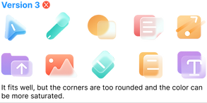
Study 2: Icon Design
We realized a clear and creative UI design can increase the efficacy and efficiency of use. After rounds of iterations and feedback from users, we set the style of the icons to be suitable for office properties with appropriate shapes, colors, and semantic elements.
Iterations


Final version

Study 3: Templates
The templates give people an easy start during communication and they save users’ time. Due to the limited project time, we did a poll with 300 people to find out the most valuable templates for video conferences. We chose templates that have over 50% polls and designed them to match the style of the Whiteboard.
Template poll

Poll result
Quantitive research
225 out of 300 people answered this question. Templates that are over 50% in the poll are chosen.

Templates visual design


Redesign


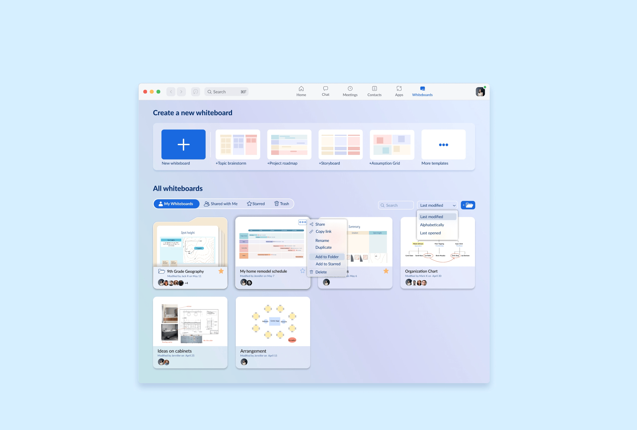
A clear and convenient whiteboard management panel
Our goal for the whiteboard management panel is to help users organize their whiteboard files in an effortless way, no matter if the files are their own or shared by other people, and no matter if it's a single file or a series of files from recurring meetings.
The new offline whiteboard panel would be designed to let users start a new board quickly. And it automatically organizes all the whiteboards from one meeting or the recurring meetings in one designated folder. This benefits users’ need to one-click share files after meeting too.
We did three options of wireframes and analyzed their pros and cons. And chose the third one to develop.
Option 1

Pros:
-
Side bar is easy for navigation.
Cons:
-
Side bar takes too much space.
-
Whiteboard preview is too small.
-
Showing all or old whiteboard is unnecessary in a whiteboard folder.
Option 2

Pros:
-
Whiteboard preview is easy to read.
-
Meeting groups are clear.
Cons:
-
Templates entry is hidden.
-
Whiteboard preview is too big and waste the space.
-
Folders and single whiteboards are indistinguishable.
Option 3

Pros:
-
Easy to find the New whiteboard button.
-
Provide prominent templates entry for an easy start.
-
Whiteboard preview is easy to read.
-
Folders and single whiteboards are distinguishable.
-
Whiteboard category tabs, sort bar and search bar are well organized and help users to find the whiteboard quickly.

Redesign
An optimized in-meeting “Share” panel
We re-categorized the content that users can share during the meeting. The three groups are:
-
Screen - whole desktop, single opened application, or external devices.
-
Whiteboard - a new blank whiteboard, or an existing “my whiteboard”.
-
Files - users’ cloud files.
With a more clear organization, users can find the whiteboard entry easier in the meeting. And the gap between the offline whiteboard and online meeting is bridged, which makes the whiteboard more useful and completes the user journey.
Redesign


TAKEAWAY
Impact
We did another round of user testing with our final design.
Here’s a summary of the results.
-
92% of the users would love to use the redesigned whiteboard in their daily work and study.
-
83% of the users thought the redesigned whiteboard functions well coverred their daily needs.
-
90% of the users thought the redesigned whiteboard management panel would improve their working and collaboration efficiency.
-
95% of the users thought the redesigned share panel made it easier for them to share whiteboard during meetings.
Takeaway
As a budding UX designer, this re-design exercise is a rewarding experience with collaborating with another UX designer. Through the process of “research - empathy - define - design - test”, I learned the importance of testing often with users and updating the design quickly with their feedbacks. And it is very practical to make priorities for any ideas and features as the time and resources are limited in real life.
If this is a real project, the next steps are to include more popular templates for users. Although dark mode is not the top priority in this project, this trending design does improve users’ experience. we have tried on the dark mode but not in-depth yet. We need to do more exploration and user testings to nail down the design system. Another tryout is cross-platform designs as people are using Zoom and Whiteboard on tablets and smartphones as well.


