


Role: UX research, UX design, Prototyping, Visual design
Tool: Adobe XD, Adobe Illustrator, Adobe Photoshop
Duration: August - November 2022 (4 months)
OVERVIEW
Project Background
The Hyperloop is a proposed transportation system that would use vacuum-sealed tubes to transport passengers or freight at high speeds. The primary business goal of Hyperloop is to revolutionize the transportation industry by providing a faster, more efficient, and cost-effective alternative to existing modes of transportation such as trains, planes, and automobiles. By reducing travel time and increasing efficiency, the Hyperloop has the potential to unlock new economic opportunities, connect people and businesses across long distances, and reduce the carbon footprint of transportation.
I attended Hyperloop Studio at UCLA and designed the prototype of Hyperloop pod and its future transit hub, where I learned insightful user experience. "Travel with Hyperloop" is a conceptual project that envisions an innovative booking experience for the cutting-edge mode of transportation, as well as an enhancement to current transportation booking applications.


PROBLEM STATEMENT
Travelers who are less familiar with the booking process or have specific preferences experience frustration when booking transportation tickets due to the limited search capabilities and a lack of necessary travel information. This results in wasted time and effort for travelers and a potential loss of revenue for the transportation company.
THE GOAL
To provide a user-friendly, and efficient booking app that saves travelers time and effort when searching for the most suitable Hyperloop tickets and accessing necessary travel information, ultimately increasing customer satisfaction and loyalty, and driving revenue growth for the Hyperloop transportation company.
What Sets Hyperloop Booking Apart

1
Ticket Builder
“What you see is what you get” by matching the booking interface with the real tickets.

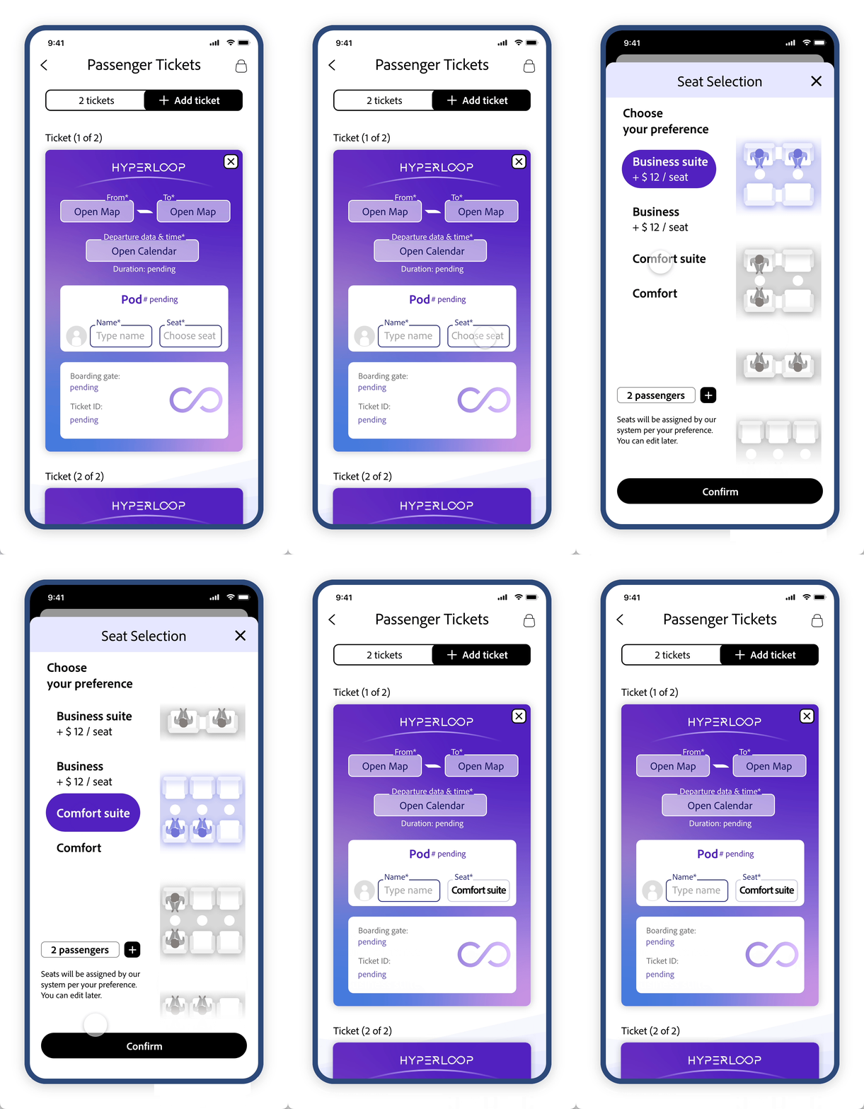
Prototype 1 - choose seats at first
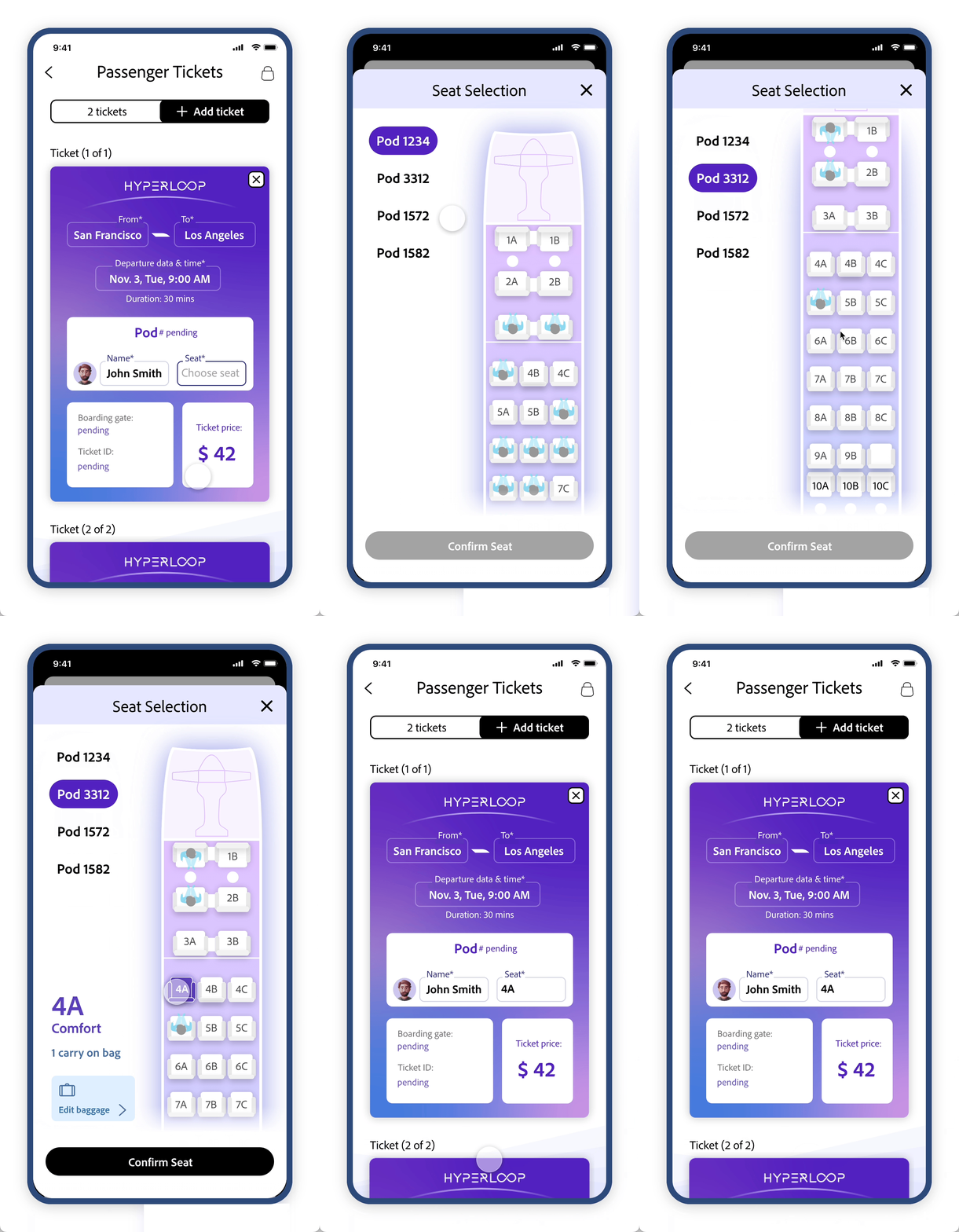

Start your booking journey from anywhere you feel important to avoid back and forth search.
Flexible Search Order
2
Prototype 2 - choose seats at last

3
Hyper Pass
Long-distance daily commuters can schedule and manage their sears easily with "Hyper Pass"
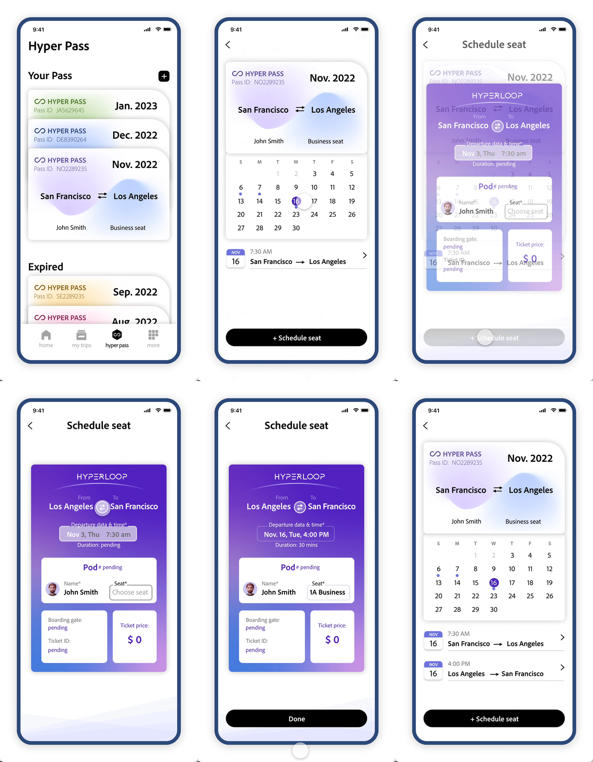
Prototype 3 - Schedule seat with Hyper Pass
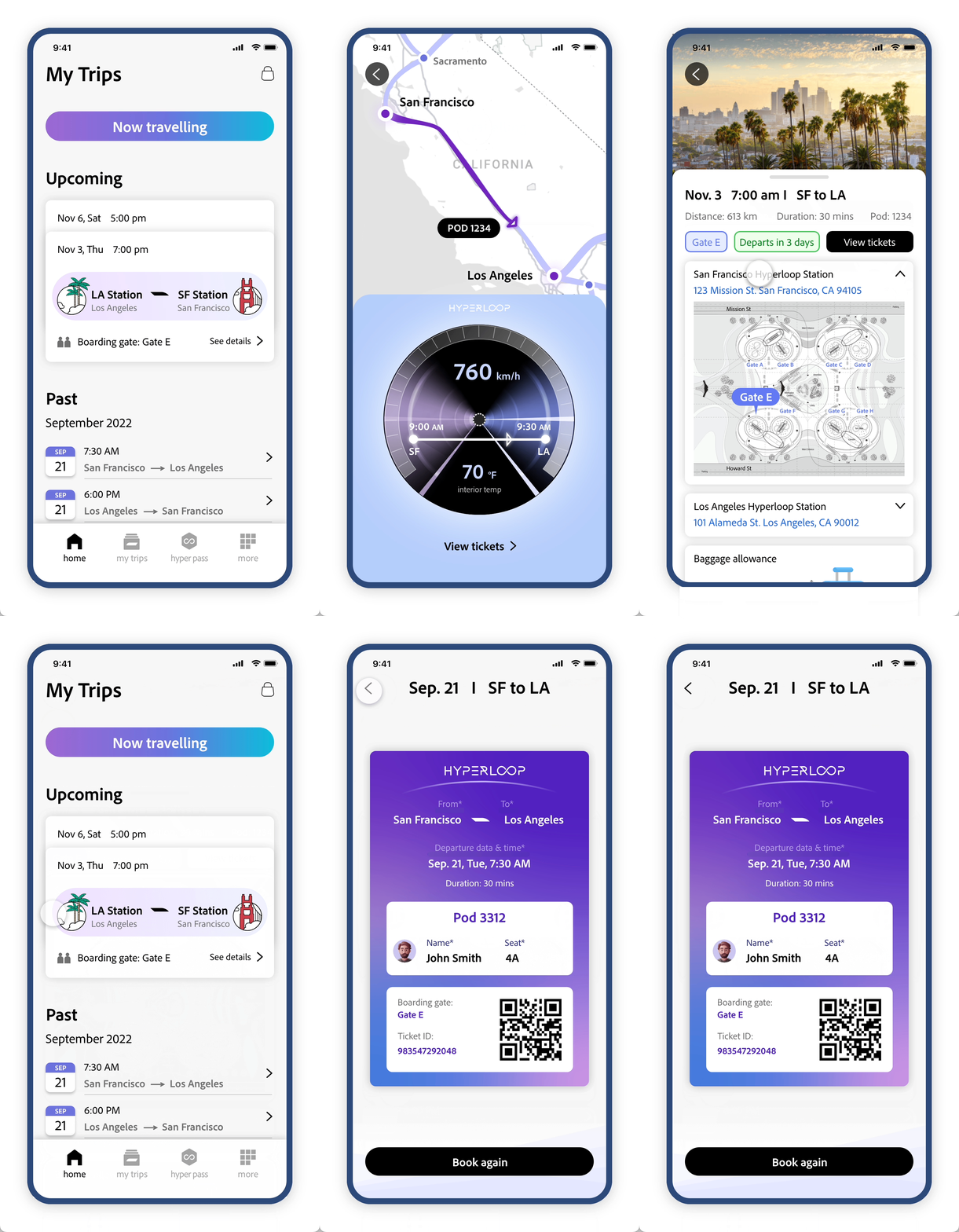
My Trip - an information hub

Achievement board

Get informed before, during, and after the trip through "My Trips" & "Achievement board".
All-in-one information
4
Design Principles

UNIFIED
People book tickets with different devices such as mobile phones, desktops, kiosks, etc. We want to design a pattern that can be applied to different devices easily. The “ticket as is” is the pattern we chose after exploration.

UNDERSTANDABLE
We want to enhance the whole booking experience and make it a pleasant process for customers. We integrate interactive seat selection and destinations on the map, illustrations, and providing real-time updates.

ACCESSIBLE
Hyperloop App is to serve as many customers as possible. The app uses large fonts and high-contrast color schemes. It is also optimized for use with assistive technologies and designed to be easily navigated using just one hand.
Design Process

RESEARCH
In the early stage of launching, Hyperloop booking app’s target users are people between 18 to 45 years old who live in big cities in the US and do long-distance travel more than twice a year. I did 1:1 interviews with 12 individuals who meet the requirements above. Since there is no landed Hyperloop travel yet, all my questions are based on train or airline travel experience.
I ASKED QUESTIONS ABOUT:
Their booking experience with airline or train apps.
Things they care about when they book tickets.
Frustrations when using the apps for booking.

Empathy maps
User Interview
Insights: customers face obstacles of:
Unclear & multiple steps
This can be frustrating for users who may be in a rush to complete their booking or may not be familiar with the booking process. As a result, they may abandon the booking altogether or turn to other options.
Inflexible search options
Customers may search for preferred seats or departure times without finding relevant filters, which can lead to starting the search again or accepting less-than-ideal options, leading to frustration and wasted time for customers.
Scattered information
Important information scattered throughout app causes frustration for users seeking critical travel details such as speed, location, boarding status, and station maps. Clear and accessible information is crucial for safe and hassle-free travel.
Competitive Research
To find out the drawbacks in the current typical booking process, I went through the popular airplane and train ticket booking apps in the U.S. Their user flows are similar.

INSIGHTS
Current airline or train booking apps follow the linear sequence of booking — Depart & Arrival, Date, Time, Seat class, Personal information, and Specific seat . People can’t choose their preferred before selecting any flight. If they find the seat is not suitable for them at last, they have to start over the process. The inflexible user experience makes the process inefficient.
EMPATHY
Persona & User Stories


User Journey Map

To understand the experience of the traveler as they interact with the app, from planning to the finish of the trip, a user journey map is created. By mapping out the user journey, three opportunities are extracted.
IDEATE
How Might We?
How might we simplify the booking process and make it more user-friendly?
1
How might we let customers customize their booking process to improve efficiency?
2
How might we let users get informed throughout their Hyperloop journey?
3
Feature Ideation


App Site Map

PROTOTYPE & TEST
Wireframe
Mockup & Prototype
1
"Ticket builder" - Match between the booking process and the real tickets
Users’ uncertainty about the unknown steps ahead increases their mental load, which makes them feel unsure and tired of the process. By showing the visible outcome at the beginning of the user journey and marking the editable items, the design gives users a clear idea of what information they need to input.


Home
Passenger ticket booking

Vehicle ticket booking

2
Flexible search by
Customizable booking paths
To reduce the time users spent when they go back and forth editing the search input, the flexible searching order allows users to start from anywhere they feel important. The booking interface changes as users input the information. The pod number, travel duration, ticket price, boarding gate, & ticket ID - will be shown when it’s available.


Vehicle ticket booking

Prototype - Vehicle ticket booking

Vehicle ticket booking
The concept of the vehicle ticket booking assembles the passenger ticket. Instead of the passenger’s name and selecting the seat, the vehicle ticket booking asks the information on the vehicle license plate and the vehicle size.
3
Hyper Pass
- a monthly pass for frequent travelers


The service of Hyper Pass may not seem familiar to most of users. To make the Pass purchasing intuitive and promote the service, the design shows the final real pass as a reference. What you see is what you get. It makes the purchasing process clear and easy.
HyperPass

Purchase new Pass

Purchase success page

Hyper Pass

Inside a Hyper Pass

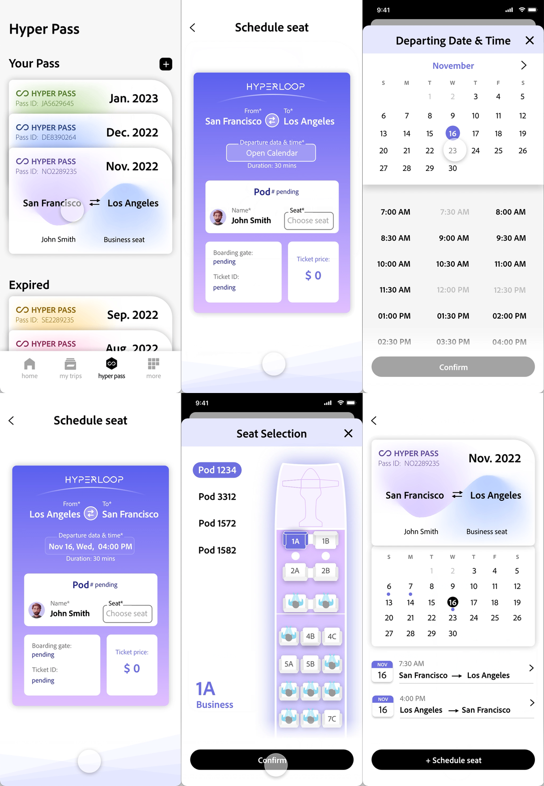
Remind users to schedule seats right after the Pass is purchased.
When scheduling seats, the calendar view of the Pass gives users a clear view of their trip schedules. The editable items are clearly shown and guide users to complete them.
Schedule seats for Pass
Prototype - schedule a seat for Pass
4
Information throughout the journey

“My Trips” - a hub for users to get travel-related information before, during, and after the Hyperloop trip.


“Upcoming trips” - help users prepare their trips to rest assured.


“Now traveling” - real-time information during the trip.
“Past trips” - re-book with preferences instead of starting from scratch.
5
Achievement board
Despite the personal information and payment method, the achievement board includes the destinations, total travel time, and the direct emission by traveling with Hyperloop. It shows Hyperloop’s efficiency and green energy and encourages users to take it.

More

Achievement board in My Account
6
Onboarding
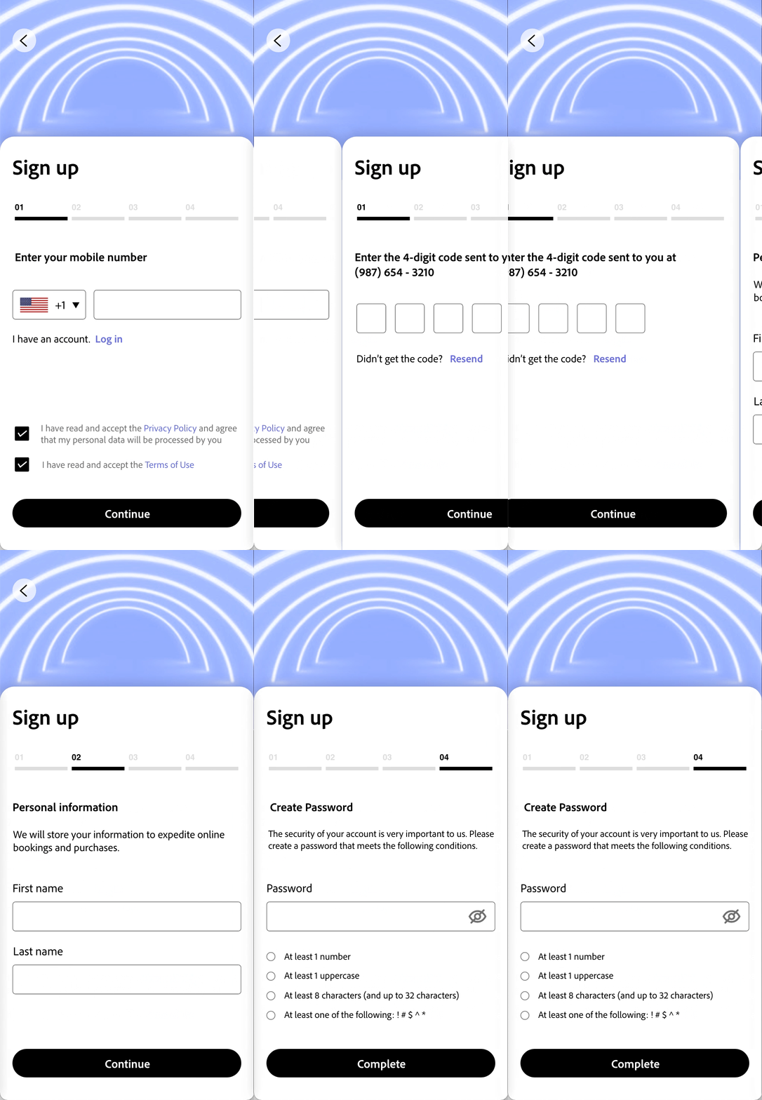
The app has an inviting onboarding and allows users to log in, sign up, quickly book and manage trips without logging in.
Biometric log-in lets users log in quickly.
When signing up, communicate with users so that they understand the reason why we need the information.

Onboarding

Login
Sign up
OUTCOME
Measure success
I conducted moderated usability testing, both in-person and remotely.
I focused on passenger and vehicle ticket booking, Hyper Pass purchasing, and scheduling seats with Hyper Pass.
Below are some of the scenarios I prompted:
-
You are going to travel from San Francisco to Los Angeles together with your friends by Hyperloop on weekend. You are booking tickets and seating next to each other is your first priority.
-
You can travel in your car with Hyperloop so that the last mile is never an issue. You are booking a vehicle ticket for your travel.
-
Let’s say you are commuting between SF and LA 3 days a week with Hyper Pass. Please buy a Hyper Pass.
-
With a Hyper Pass purchased, you are going to schedule seats for future trips.
-
I asked them on a scale of 1-10, how likely are you to recommend “Travel with Hyperloop” to a friend?

Achievement

7 mins
passenger ticket booking
10 mins
vehicle ticket booking
5 mins
Hyper Pass purchasing
3 mins
scheduling seats
with Hyper Pass


What I learned
While working on this project, I acquired valuable insights into the importance of exploring both the problem space and the design space. By conducting extensive user research, mapping out user journeys and pain points, and identifying opportunities, I was able to develop a more effective solution that met the user's needs. Additionally, by creating multiple design options and soliciting feedback from users, I was able to create a more user-friendly solution. Through this experience, I enhanced my understanding of accessibility design by conducting user testing and following WCAG guidelines. This allowed me to create a more inclusive experience that met the needs of all users.
Future roadmap

Gain more insights from team collaboration

Study and optimize the checkout process

Build a robust design system and branding

Implement up-to-date design and technology


