Review Insights App
Designing Trust in Restaurant Reviews

The Problem
The current structure of review platforms hinders consumers ability to establish reason behind a restaurants rating at a high level. In order for users to accomplish this today, they would have to read through hundreds of reviews.
%201.png)
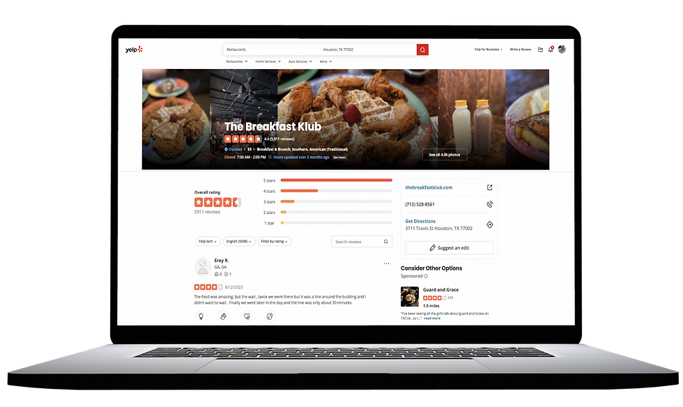
Review platforms today breakdown a restaurants overall rating by rating distribution, and individual user reviews that makes up that score.
The current system makes it easy to know what a user left holistically, but not why they left it. Each reason is unique and may not always resonate with the reader.

*The image showcases the data structure we commonly see in review platforms today.
“How can we redesign review platforms to make it easy to evaluate the business holistically, and define the scores assigned to a business?”
The Goal
Our goal is help users better identify the reason a restaurant has received it’s current standing overall score by incorporate new KPI’s, resulting in a dashboard, that capture more context.
Strong data insight tools provide users with context that explains why a restaurant has a certain overall score, so that they can take appropriate action.
If they have an inadequate understanding of “why,” hinders are ability to take action.
%201.png)
Key Questions

COMPETITIVE ANALYSIS
We examined competing companies in the market to determine their capability to deliver key information to users amidst a surplus of data.
We found that these companies have a wide range of slicing capabilities, but have limited data visuals.
We want to organize these in a way that removes the need to perform so many actions before extracting value, so users can find what they're looking for effortlessly, immediately, and transparently.

TEXT ANALYSIS
Our goal was to identify common conversation points that aren’t currently being captured that may add value to a customer’s decision making process. To achieve this, we employed web scraping and utilized Voyant to examine a dataset consisting of 3,418 online customer reviews across four restaurants in Texas.

In our analysis, we considered factors such as word frequency, context, and correlations to identify the most pertinent keywords for review readers.
This meticulous process not only reaffirmed our competitive analysis findings, but it highlighted the significance of categories and subcategories of importance to restaurant-goers. It is worth noting that our text analysis results will undergo further validation through the use of surveys.

* Figure represents what we discovered in our text analysis. After analyzing 390 reviews between 4 different restaurants, we found these to be the common words discussed
BUILDING OUR SURVEY
Our process was guided by our data analysis results. We aimed for a sample size that would provide a high confidence level in the results, with a low margin of error.
We conducted a pilot test with a small group of participants to identify any ambiguities, issues with question wording, or technical problems. Adjustments were made based on the feedback. The final survey was distributed online, via social media, in relevant interest groups that comprised of our target audience.

Synthesizing Survey Results - main categories
With the survey results we aimed to determine the hierarchy within the text analysis that the users prioritized. Through statistical analysis, we uncovered the main categories that were important to the following survey respondents:

New Defined Structure
In line with the text analysis results, the restaurant KPIs identified as most important by survey participants were: Food, Service and Value
For each category, we identified subcategories of interest that will be part of the Dashboard
Food sanitation and Matching menu choices were considered important for participants, but are better suited for the restaurant’s page

Lo-Fi wireframing
After restaurant selection, users will be taken to a dashboard that shows a broad overview of performance, including overall rating, review count, and how their rating has changed over time. The most recent reviews will be shown below the overview with an option to search and sort.
Users interested in a more in-depth exploration will have the option to view from three topics: food, service, and value. Sub-categories related to the selected topic will be displayed based on available data, with the most data-rich subcategories shown first.
The side panel view allows users to view photos, basic details about the restaurant, and gives the ability to toggle to other pages using filters.


Hi-Fi wireframing
Upon searching for a cuisine and selecting a restaurant from the search results, users are taken to a dashboard. The dashboard provides a high-level overview of data about the selected restaurant, including overall scores such as average rating, review count, and a timeline depicting how the rating has changed over time, with business updates for context.
Underneath the overall score, the data is sliced into new KPIs which are Food, Service, and Value, as well as their respective subcategories. Users have the flexibility of choice toggling between positive and negative reviews to gain a well rounded understanding of the restaurant.

Users are able to drill down and filter data by Food, Service, or Value. By clicking on any of these three topics, the entire dashboard changes to reflect that KPI.For example, selecting “Food” causes the overall score, subcategories, positive reviews, and negative review shows that exclusively relates to “Food”. This function enables users to analyze restaurant information based on their specific areas of interest.

Users may also filter and cross-filter data by selecting other charts on the dashboard. For instance, selecting "5 stars" displays data that has been rated with 5 stars. Selecting "Service" and "5 stars" shows information that is rated with 5 stars and falls under the "Service" category. And so on. This level of filtering precision alleviates both the stress and time spent by users manually parsing through countless reviews.
